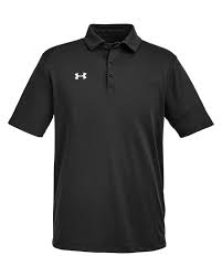
We provide expert t-shirt design and printing services that help you select the perfect colors and fonts for custom apparel that reflects your brand and gets noticed. Learn how to choose design elements that make your shirts unforgettable.
Designing a custom t-shirt isn’t just about slapping a logo on fabric—it’s about telling a story, capturing attention, and creating something people want to wear. Two of the most critical elements in this process are color and font choice. Whether you’re promoting a business, hosting an event, or building team unity, the right combination of design elements can turn a simple shirt into a powerful branding tool.
Choosing the best colors and fonts for your t-shirt design doesn’t have to be complicated, but it does require some thoughtful decisions. At MyInkADo, we guide our clients through every step to ensure the final product is eye-catching, on-brand, and designed to last.
Get to Know the Psychology of Color in T-Shirt Design
Color isn’t just aesthetic—it’s emotional. Each color evokes a different feeling and helps communicate your brand’s message. When selecting colors for your custom t-shirts, think beyond your personal favorites and focus on how your audience will perceive them.
Here’s what common t-shirt design colors convey:
Red: Energy, passion, urgency – great for sales or sports
Blue: Trust, professionalism, calm – ideal for corporate branding
Green: Growth, health, nature – perfect for wellness and eco-conscious themes
Black: Sophistication, elegance, power – often used for upscale or sleek designs
White: Simplicity, purity, cleanliness – works well with bold logos and minimalist brands
Also, consider your background color. A black shirt with a yellow logo gives off a completely different feel than a white shirt with a navy design. Contrast and readability are key—make sure your colors stand out without clashing.
Match Colors to Your Brand and Message
When printing custom shirts for your business, your brand identity should lead your color choices. If your company colors are blue and silver, those shades should take priority. Consistency builds recognition, and seeing those same colors across shirts, websites, and business cards reinforces your brand image.
However, don’t be afraid to adjust your palette slightly to suit fabric colors or shirt styles. For example, a light version of your brand blue might show up better on a black t-shirt than the original navy. Our design team can help you make those small tweaks that keep your look both consistent and readable.
Choose Fonts That Reflect Your Style and Purpose
Fonts are just as important as colors in your t-shirt design. They can be fun, bold, elegant, edgy—or a mix of all four. A font can change the tone of your message in an instant, so choosing the right one means considering both legibility and style.
Stick with easy-to-read fonts, especially if your text is the main feature. Avoid script fonts for all-caps text or long words, and steer clear of decorative fonts unless they’re essential to your brand.
Here are a few font types and their typical use cases:
Serif fonts (like Times New Roman): Traditional, formal, professional
Sans-serif fonts (like Helvetica): Clean, modern, minimal
Script fonts (like Pacifico): Elegant, personal, friendly
Display fonts (like Impact): Bold, attention-grabbing, ideal for slogans
Combining fonts can work well too—try a bold sans-serif for your main message and a clean script for a tagline. Just be careful not to use more than two different fonts in a single design to keep things cohesive.
Keep Your Audience and Purpose in Mind
The best t-shirt designs are made with the wearer in mind. If you’re designing shirts for a college event, bold and trendy colors might resonate more than neutral tones. If your shirts are for staff uniforms, consistency and readability take priority.
Also think about your shirt’s context:
Outdoor events need high-contrast designs that pop in sunlight
Corporate settings call for more subdued, polished looks
Fundraisers and campaigns benefit from fun, bright colors and bold fonts that inspire action
By understanding your audience’s expectations and the shirt’s purpose, you can select colors and fonts that connect meaningfully and motivate engagement.
Work With a Team That Understands What Works
Designing a shirt that looks great on a screen is one thing—making sure it prints correctly and looks amazing on fabric is another. That’s where our expertise comes in. At MyInkADo, we help you test color combinations, adjust font weights, and align designs for perfect placement.
We also consider how your shirt will be worn. Is it a unisex cut or fitted? Will it be worn layered or alone? These details affect how your design is seen, and we make sure everything translates from concept to finished product with clarity and confidence.
Our team can also help you select ink types and shirt materials that match your vision, whether you’re after a soft, vintage feel or a bold, high-gloss finish.
For More Support With T-Shirt Design That Makes an Impact
For more support in creating custom t-shirt designs that truly represent your brand, MyInkADo offers the design expertise, printing quality, and customer care you need. We don’t just print your ideas — we help you shape them into apparel your audience will want to wear.
Whether you’re launching a new product, promoting an event, or building team identity, we guide you through choosing the right fonts and colors that communicate your message and enhance your brand’s presence. Let’s bring your t-shirt ideas to life with clarity, creativity, and craftsmanship.
Reach out today and let’s start designing shirts that speak volumes.


