A great logo not only looks good—it prints well. When designing for screen printing, logos have to be clear, bold, and optimized for fabric. Whether for team apparel, business hoodies, or event shirts, strong logo design drives brand recognition, wearability, and impact.
This guide explains what makes logo art ideal for screen printing, how to prepare your files, and tips for designs that stand out on sweatshirts, hoodies, and tees.
Clarity and Simplicity: The Foundation of Screen‑Ready Logos
The most successful logos for screen printing are simple and easily recognizable. Why? Screen printing works by layering ink through mesh screens—fine details and tiny text can get muddy or lost entirely once ink spreads slightly on fabric.
Great logo features for screen printing include:
- Distinct shapes that are identifiable from a distance
- Minimal fine detail, especially in small elements
- Clear text with fonts that read easily when printed
- High contrast between colors to keep elements from blending
Think of iconic logos like the Nike swoosh or simple team emblems—their strength lies in simplicity. For a more visual breakdown of effective logo traits, design pros at Canva explain why simpler graphics often work best in print and on merchandise.
Balanced Color Choices for Screen Printing
Color isn’t just decorative—it’s functional in screen printing.
For screen printing:
- Limit your palette to 3–5 solid colors when possible. Each additional color increases complexity and cost.
- Use high contrast combinations (light on dark or dark on light) so your design “pops.”
- Avoid gradients or subtle shading, which can be difficult to execute cleanly with traditional screen methods.
If you want detailed color gradients, consider hybrid approaches like Direct‑to‑Film (DTF) or DTG for those pieces—but for screen printing specifically, bold flat colors work best.
Scalability: From Chest Print to Full‑Back Graphics
A great logo must look good at multiple scales. It should be:
- Recognizable small (like a chest logo)
- Impactful when enlarged for the back of a hoodie or crewneck
Test your logo by viewing it at different sizes. A symbol that looks sharp on a 3‑inch chest print should also hold its shape at 12+ inches on the back.
If your logo loses clarity when resized, consider simplifying elements or separating text and symbol versions for each placement.
Readability and Typography
Fonts matter. Text is part of the design, and when printing on fabric, it must stay legible from normal viewing distance.
Good typography for screen printing:
- Uses sans serif or bold serif fonts
- Keeps letter spacing balanced
- Avoids ultra‑thin lines that can fill in with ink
Long event names or mottos may need abbreviations or reformatting to stay crisp on apparel.
Preparing Your Logo File for Screen Printing
Once the design is finalized, the file setup makes a huge difference in print success. Screen printers typically need:
- Vector files (AI, EPS, or PDF) for crisp scaling
- Solid color layers separated for each ink screen
- Transparent background with easily selectable elements
If your design is raster (like JPG or PNG), it should be high resolution (300 dpi or higher) and cleaned up before conversion to vector.
Using the Start Your Design tool on MyInkADo ensures you upload the correct formats and get guidance on proofing before printing begins.
Placement Matters: Where Your Logo Lives
Great logos also consider placement. Common spots include:
- Left chest for a classic, subtle look
- Center chest for mid‑level impact
- Full‑back for bold statements
Consider the garment type:
- Hoodies and crewnecks work well with larger back prints
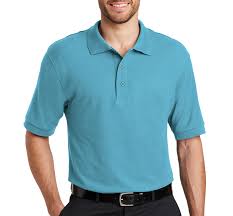
- T‑shirts support chest and sleeve placements
- Shirt pockets often benefit from compact, simple marks
Mixing placements is also popular—for example, a small chest logo paired with a large back version creates balance and style.
Materials and Print Method Synergy
Not all fabrics and print methods react the same way.
- Heavy cotton hoodies and sweatshirts take screen printing beautifully due to absorbent surfaces
- Poly blends may require special inks for wash durability
- Dark fabrics work best with underbase white for contrast
Browse the Sweatshirts & Hoodies page to pick materials that support bold printing. Also check the T‑Shirts page for lighter fabrics that bring out logo colors differently.
Common Logo Mistakes to Avoid
Even solid graphics can fail if these issues are present:
- Too many colors, leading to muddied prints
- Ultra‑thin lines that fill in with ink
- Low contrast that fades into fabric
- Overly complex illustrations without clear hierarchy
Keeping designs clear and bold makes screen printing both more affordable and more effective.
Real Customer Testimonial
“My logo came out sharper than expected on both shirts and hoodies. The proofing process helped us tweak text size, and the final screen prints look professional even after dozens of washes.” — Camila R., Fort Worth
Find The Right Vendor for You
If you’re looking for custom apparel with impactful logos that print brilliantly on shirts and hoodies, MyInkADo makes the process smooth. We provide expert help refining your artwork for screen success. Great prints begin with great logos—let’s make yours stand out.