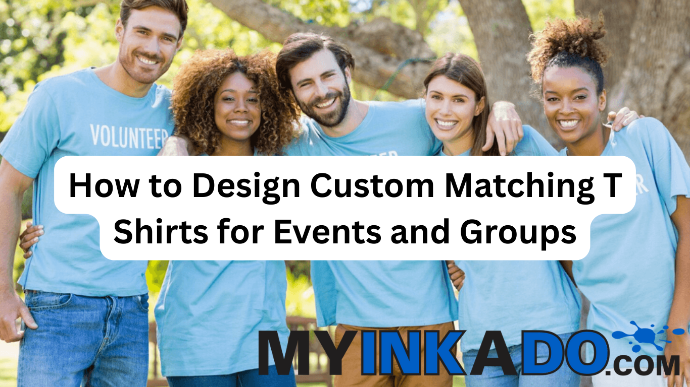
Custom matching T shirts make events and group activities more memorable. Whether it’s a company retreat, school trip, family reunion, team fundraiser, or community event, well‑designed tees create unity, spark conversation, and serve as lasting keepsakes.
Designing effective matching shirts involves more than slapping a logo on fabric. Good design balances branding, readability, comfort, and purpose — all while making your group look and feel connected.
Start with a Clear Purpose and Theme
Before you design anything, define the purpose of your shirts:
- Is it for a fundraising walk or run?
- A corporate team‑building event?
- A school club outing?
- A family reunion or birthday celebration?
Knowing the theme helps guide color choices, imagery, and messaging. A family reunion shirt might use playful names and dates, while a charity run shirt could feature a mission statement or cause line.
Themes also help determine whether a design should be bold and fun, elegant and simple, or branded and professional.
Choose a Strong Central Design Element
Most successful group shirts include a central design that visually ties the event together.
Common options include:
- Group name or event title
- Logo or mascot
- Tagline or slogan
- Iconic imagery or silhouette
Simple, bold graphics work best for printing. Complex, photographic designs may get lost in screen printing or require Direct‑to‑Film (DTF) or Direct‑to‑Garment (DTG) to pull off all the color detail.
For group projects, the central design is often printed on the center chest or back for maximum visibility.
Select a Color Palette that Pops
Color choice matters. Contrasting colors help designs stand out, and limited palettes often print better. A good rule of thumb is to use:
- 1–3 main colors for the design
- A shirt base color that makes the graphics visible
- High contrast between ink and fabric
Bright shirts (like neon green) can stand out at outdoor events, while classic black or navy looks professional and versatile.
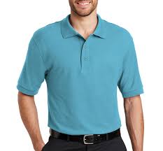
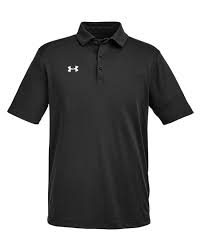
To explore fabric options and how colors display, visit the T‑Shirts page to mix and match styles. Picking a garment your group likes ensures wearability after the event.
Plan for Logo and Text Placement
Placement affects readability and impact.
Popular options include:
- Front center — big and bold
- Left chest — subtle and professional
- Back — large event titles or sponsor logos
- Sleeve — dates, numbers, or small icons
Think about how the shirt will be worn — standing, walking, or posed in a group. Placement should make the design easy to see without being awkward.
If your event involves sponsors, a sleeve, back, or lower hem placement works well for additional logos without crowding the main design.
Balance Text, Graphics, and White Space
Good shirt design uses white space effectively. Overcrowded graphics or text can look cluttered and lose impact on fabric.
Keep these tips in mind:
- Combine text and images with breathing room
- Choose bold fonts that read from a distance
- Avoid tiny details that disappear once printed
A modest amount of text — team names, dates, or short slogans — often works better on fabric than long paragraphs.
Design for Sizing and Fabric Differences
Shirts stretch and drape differently depending on size and fabric. What looks great on a small shirt may need slight scaling for XXL sizes.
A good design strategy:
- Place key elements at eye level
- Scale elements to read well on all sizes
- Choose fonts that stay legible across size ranges
Also consider fabric thickness — heavier cotton shows ink differently than performance blends.
For cozy group events that span seasons, coordinating with seasonal gear makes sense. Check out the Sweatshirts & Hoodies page for matching cool‑weather options that follow the same design direction.
Choose the Best Printing Method for Your Design
Not all printing methods suit every design.
- Screen Printing: Best for bold, limited‑color graphics and larger batches — durable and cost‑effective.
- DTF (Direct‑to‑Film): Great for smaller runs with multi‑color or full‑color art.
- DTG (Direct‑to‑Garment): Best for photographic detail or soft, breathable prints on cotton.
Each method has benefits and price implications. If you’re unsure, a professional print shop can recommend the one that fits your design and budget.
For a broader overview of printing basics and how they differ, a foundational resource from Apparel Search explains the strengths and limitations of various printing techniques.
Get Feedback Before Printing
Before production, share your mockups with team members for feedback. This helps catch issues like:
- Hard‑to‑read text
- Clashing colors
- Unclear logos
- Placement quirks
Gathering quick responses avoids revisions after production — saving time and money.
Upload your design early through the Start Your Design tool so you can see proof layouts and share them with decision makers.
Order Early and Account for Lead Times
Events have timelines — and so does printing. Lead times vary based on:
- How many shirts you’re ordering
- Your chosen printing method
- Proofing and approval turnaround
- Seasonal or peak demand
Early ordering avoids rush fees and gives you flexibility to adjust art or sizes, if needed.
Real Customer Testimonial
“Designing matching shirts for our charity run was a breeze with MyInkADo. The team helped us balance colors and text for readability, and everyone wore them with pride afterward!” — Alex G., Fort Worth
How to Start Designing Your Custom Matching T Shirts
If you’re looking for a smooth and successful custom shirt design process for your next event or group, MyInkADo provides expert support from concept to delivery. Browse styles on the T‑Shirts page, upload artwork through the Start Your Design tool, and get fast, high‑quality prints that make your group stand out.